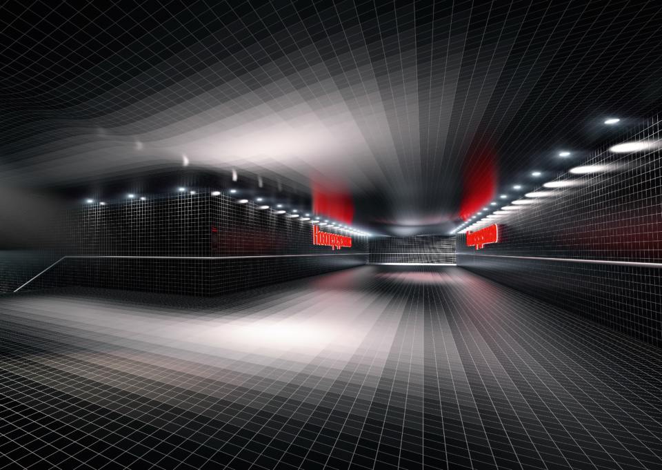
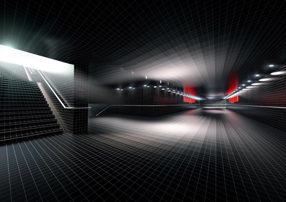
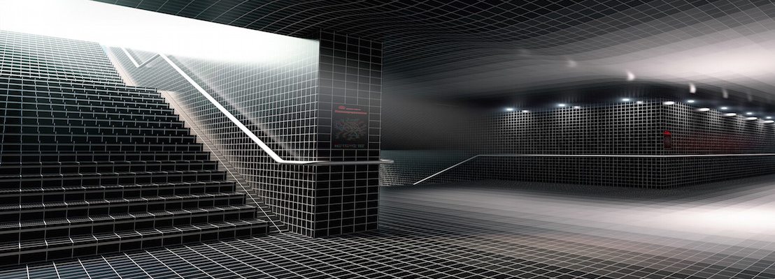
Dutch architect Maurice Nio designed the Novoperedelkino Metro Station in Moscow using tiles from the ChromaPlural range from Agrob Buchtal. Agrob Buchtal’s ChromaPlural tiles system aims to offer the best of both worlds: freedom and structure, with a large selection of colors and tile sizes, integrated in a comprehensive logic of modular dimensions and a harmonious color programme.
The ChromaPlural collection easily accommodates a huge variety of desires, with tiles in 50 colors and 29 sizes, which enables almost one and a half thousand different combinations. The sizes are arranged in two different systems, one based on multiples of 12.5 centimetres, the other one being decimal. The sizes range from 1 x 1 cm to 50 x 100 cm. Like these huge tiles, there are several sizes that are common multiples, fitting both the octametric and decimal system.
Moreover, the tiles are available in different materials and finishes: glazed or unglazed, earthenware, stoneware or porcelain stoneware. The number of possible patterns of different sizes & combinations of colors, materials and finishes runs therefore into the millions. Which is a lot, yet at the same time it isn’t infinite.

Like in almost all of Maurice Nio’s work, color plays an important role for Nio. We asked him 3 questions about this project:
Q: Can you say something about the atmosphere you want to achieve in your new Moscow metro station?
Maurice Nio:
When you enter the Novoperedelkino metro station, you go from dark to light, from the below-street underpass to the platform area. A gradient of ten shades of black, grey and white tiles guides the public downwards. The lighting is designed according to this scheme: up-lighting toward the white ceilings and down-lightning toward the white platform. There is also extra functional lighting on the walls to guide the public up and down.
Q: Your projects always have a narrative. What is it in this particular case?
Maurice Nio:
Behind a dark cloud there is always a glimmer of light. That is the concept of this project. The design for the Novoperedelkino metro station is about hope. And about forgiveness, of course. If you were cynical, you could say that this theme, this thought, could be applied to all metro stations in Moscow, but that is not true. Especially in this unforgiving neighbourhood, the theme is entirely in place. This generic neighbourhood must be inspired. By someone other than an angel?
Q: How was it to work with ChromaPlural for this project?
Maurice Nio:
For our design for the Novoperedelkino metro station, we used the ten shades of the “Neutral” grey color range. With these ten shades, we can perfectly express the idea of descending to a bright space deep underground. In order to optimise the gradient effect, we used a small tile (10×10 cm). The design of the Novoperedelkino metro station is very “quiet”, but with the same new color code, you can also achieve a “loud” design.
Agrob Buchtal is capable of fulfilling nearly every conceivable order, even outside ChromaPlural (the company’s philosophy is the opposite of “any color as long as it is black”; it is more like “every color, including black”). The main reason is that from a design perspective, unlimited choice isn’t necessarily always preferable to limitations.


